The calendar coordinate system arranges time series data into a calendar-like
layout, making it easier to see fine-grained temporal patterns over a long
time span. It has similar semantics as the looped coordinate system
(coord_loop()), however instead of overlaying looped data the calendar
coordinate space arranges each loop into rows and columns like a calendar.
coord_calendar(
  rows = waiver(),
  time_rows = waiver(),
  cols = waiver(),
  time_cols = waiver(),
  time = "x",
  xlim = NULL,
  ylim = NULL,
  expand = FALSE,
  default = FALSE,
  clip = "on",
  clip_rows = "on",
  coord = coord_cartesian()
)
Arguments
- rows
Layout the time scale into calendar rows, one of:
NULLorwaiver()for no rows (the default)A
mixtimevector giving time points at which thetimeaxis should layout into rowsA function that takes the limits as input and returns row layout points as output
- time_rows
A duration giving the distance between calendar rows like "1 weeks", or "1 month". If both
rowsandtime_rowsare specified,time_rowswins.- cols, time_cols
Not yet supported.
- time
A string specifying which aesthetic contains the time variable that should be looped over. Default is
"x".- xlim, ylim
Limits for the x and y axes.
NULLmeans use the default limits.- expand
Logical indicating whether to expand the coordinate limits. Default is
FALSE.- default
Logical indicating whether this is the default coordinate system. Default is
FALSE.- clip
Should drawing be clipped to the extent of the plot panel? A setting of
"on"(the default) means yes, and a setting of"off"means no.- clip_rows
Should the drawing of each loop of the timescale be clipped to the breaks defined by
time_rows? A setting of"on"(the default) means yes, and a setting of"off"means no.- coord
The underlying coordinate system to use. Default is
coord_cartesian().
Details
This coordinate system is particularly useful for visualizing long time spans with events that occur over short intervals (such as holidays).
It works by:
Dividing the time axis into segments based on the specified row (and column) periods
Translating each panel into the rows and columns of a calendar layout
The coordinate system requires R version 4.2.0 or higher due to its use of usage of clipping paths.
Practical usage
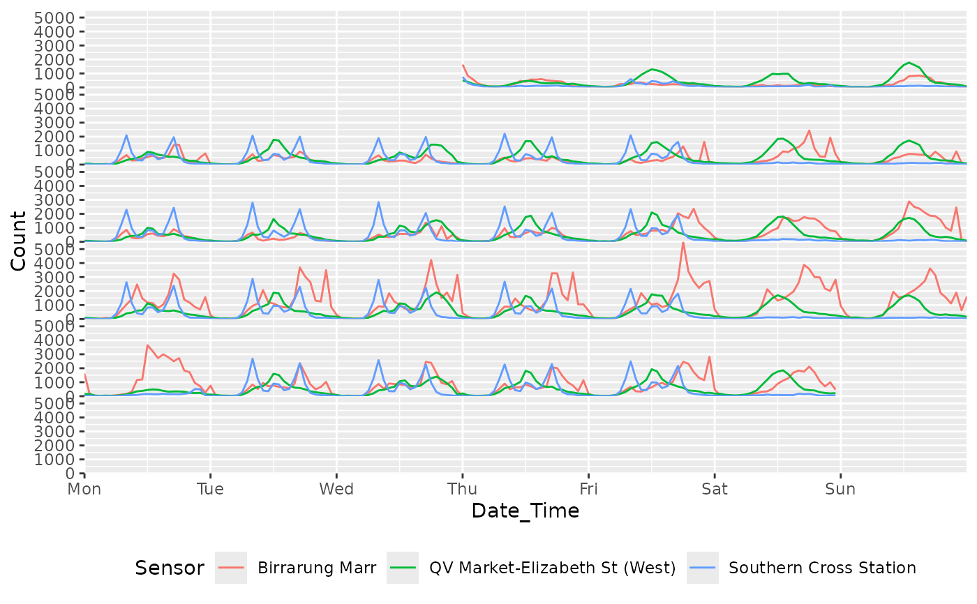
The calendar coordinate system arranges a cartesian coordinate system into a dense calendar-like layout. Calendar layouts are particularly useful for identifying specific dates or events that occur over short intervals in long series. For example, the daily pedestrian counts at Melbourne's Birrarung Marr park is nearby to several major sporting venues, and the calendar layout makes obvious the spikes in pedestrian activity that occur during annual sporting events (such as the Australian Open tennis tournament). Calendar layouts are also useful to identify the effect of holidays, especially when their dates change each year (such as Easter).
Similarly to coord_loop(), the calendar coordinate system draws geometries
that cross the boundaries of calendar rows or columns. The justification of
these geometries can be controlled with the align_mixed parameter of
scale_x_mixtime() as described in coord_loop().
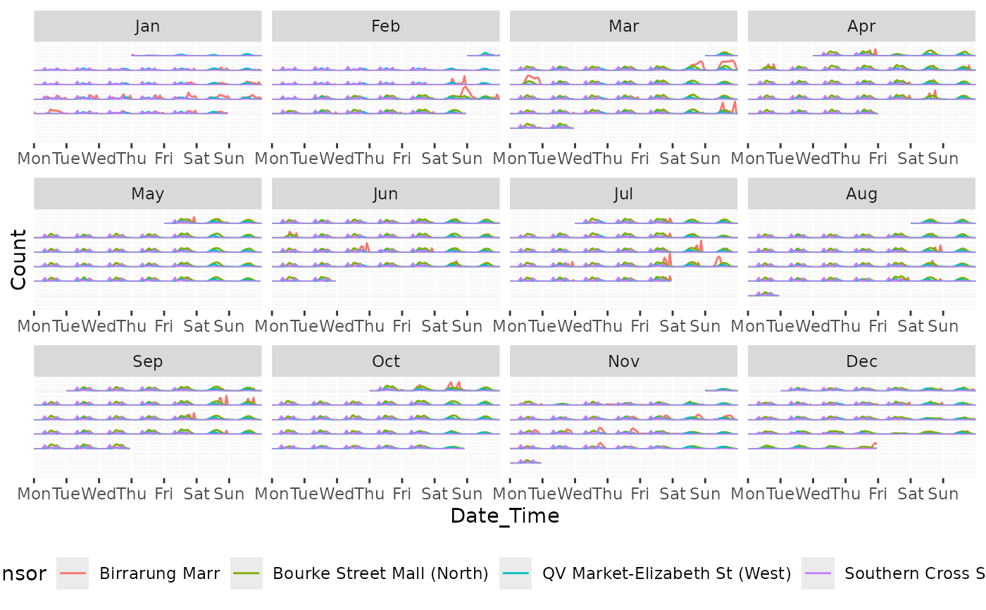
The calendar coordinate system works well in conjunction with facetting to
give more space between months and/or years of the calendar. When facetting,
using scales = "free_x" is recommended to make each facet only include
time periods appropriate for that panel.
Examples
library(ggplot2)

# A weekly calendar arrangement of pedestrian counts in Melbourne
# Notice the periods of high activity days for the Birrarung Marr sensor
# during the Australian Open tennis tournament in late January.
tsibble::pedestrian |>
  dplyr::filter(Date < "2015-02-01") |>
  ggplot(aes(x = Date_Time, y = Count, color = Sensor)) +
  geom_line() +
  coord_calendar(time_rows = "1 week") +
  scale_x_datetime(date_breaks = "1 day", date_labels = "%a") +
  theme(legend.position = "bottom")


# Monthly facets can be used to create a complete calendar for 2015.
tsibble::pedestrian |>
  dplyr::filter(lubridate::year(Date) == 2015) |>
  ggplot(aes(x = Date_Time, y = Count, color = Sensor)) +
  geom_line() +
  coord_calendar(time_rows = "1 week") +
  facet_wrap(
    vars(lubridate::month(Date, label = TRUE)),
    ncol = 4, scales = "free_x"
  ) +
  scale_x_datetime(date_breaks = "1 day", date_labels = "%a") +
  theme(
    legend.position = "bottom",
    axis.text.y = element_blank(), axis.ticks.y = element_blank()
  )
